Breaking the case: The label love-in
Kombucha brands get in a groove when fruit becomes the frame.
Picture this. (Or take a picture, like I did.)
You’re selling a trendy fermented beverage that’s been taking over cold cases by the gallon the past decade or so. It comes in a variety of flavors, probably. And color moves flavor from eyeballs to tastebuds faster than almost anything. Spread color dynamics across a wall of SKUs and suddenly you’ve got a product line.
It’s good. Perfectly sensible. But also completely invisible as soon as everyone falls in line — which they did — and now we’re overwhelmed and thirsty, staring into a fridge that looks like a music festival lost its luggage.
Raspberry gradient, tie-dyed everything that stopped being its own thing, because it’s also everyone else’s thing.
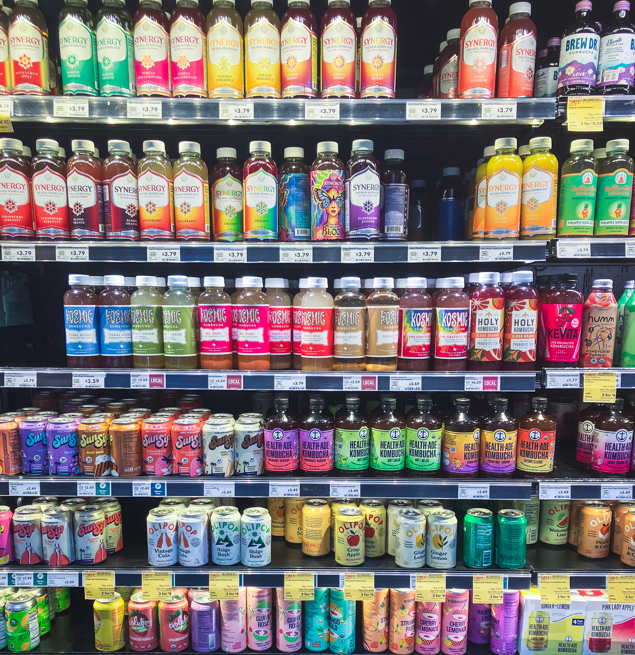
Exhibit A
The primary challenge here being working within a category defined by “health.” Vibrant color equals vibrant life. It’s a hill nobody wants to climb down from. Mandalas, hippie symbology, white containing shapes doing God’s work against bursting backgrounds. It’s a healthy shot of irony that a category dominated by peace signs is so visually shouty.
I’m not sure what it would take to break out of the love-in that is today’s kombucha case. Though there are a few options I’d want to explore. Solid colors, modular or continuous patterns. Many times, minimalism is a branch that hangs a bit lower than most brands could or should reach for. However, in this case, a super clean label would be the natural (and welcome) place for a parched would-be buyer to rest their tired eyes.
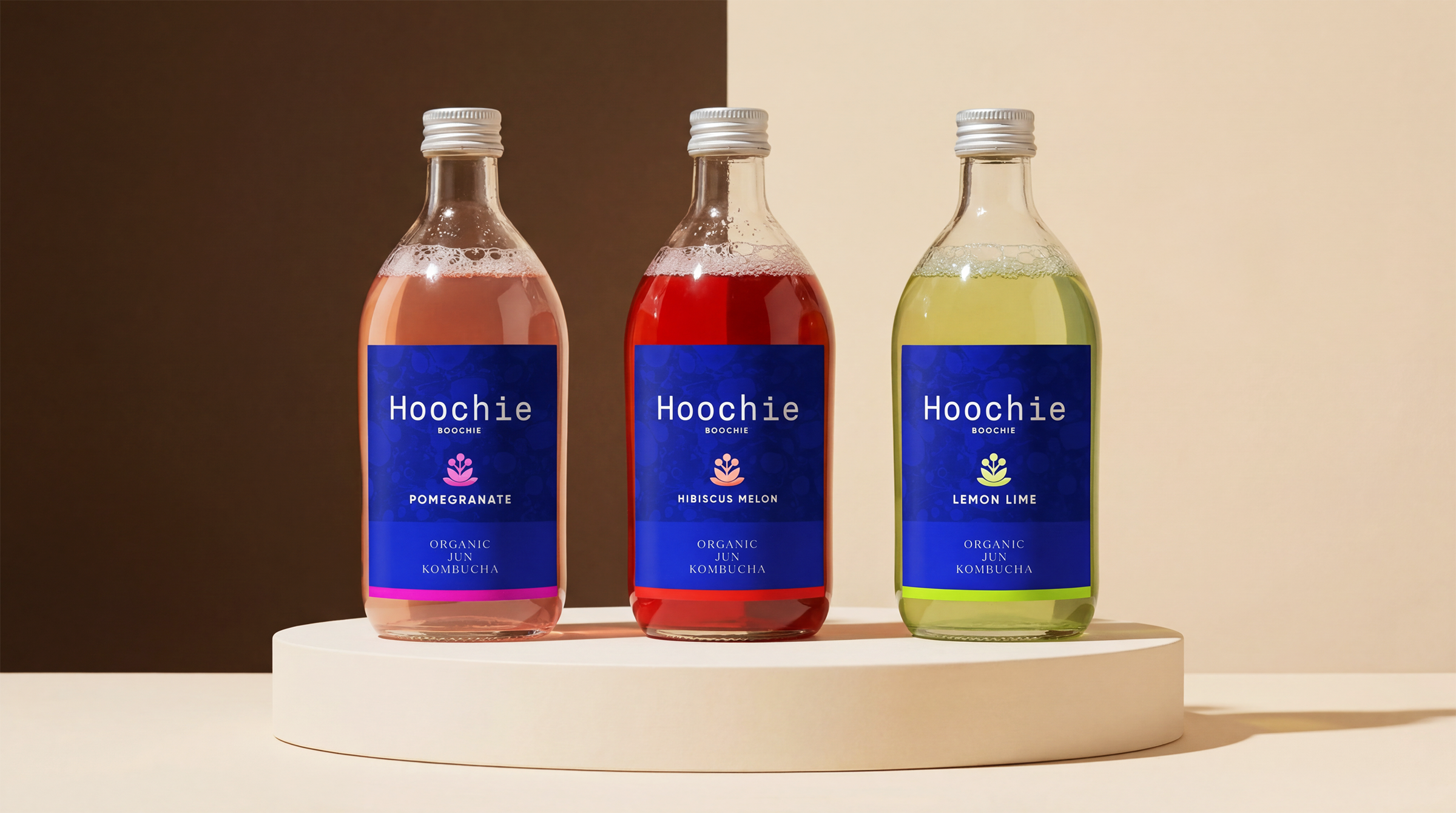
And hey, why not reach for something extremely ownable? Why not try an approach that signals you’re the champagne of bubbly non-alc fruited ferments? Or lean into a single brand color? I would love to see one of these labels step out from behind a what’s-in-the-tin flavor profile and grab hold of an identity that says, “Us? We’re the red-teal-blue-purple one.”
Why not stand behind your brand like your flag has colors you’ll never stop flying?
Against this rainbow maximalism, I’m not entirely convinced the color-flavor correlation is doing us any favors anyway. If I’m in a “green” mood, does that mean I’m reaching for lime, or mint, or chlorella or tart apple?
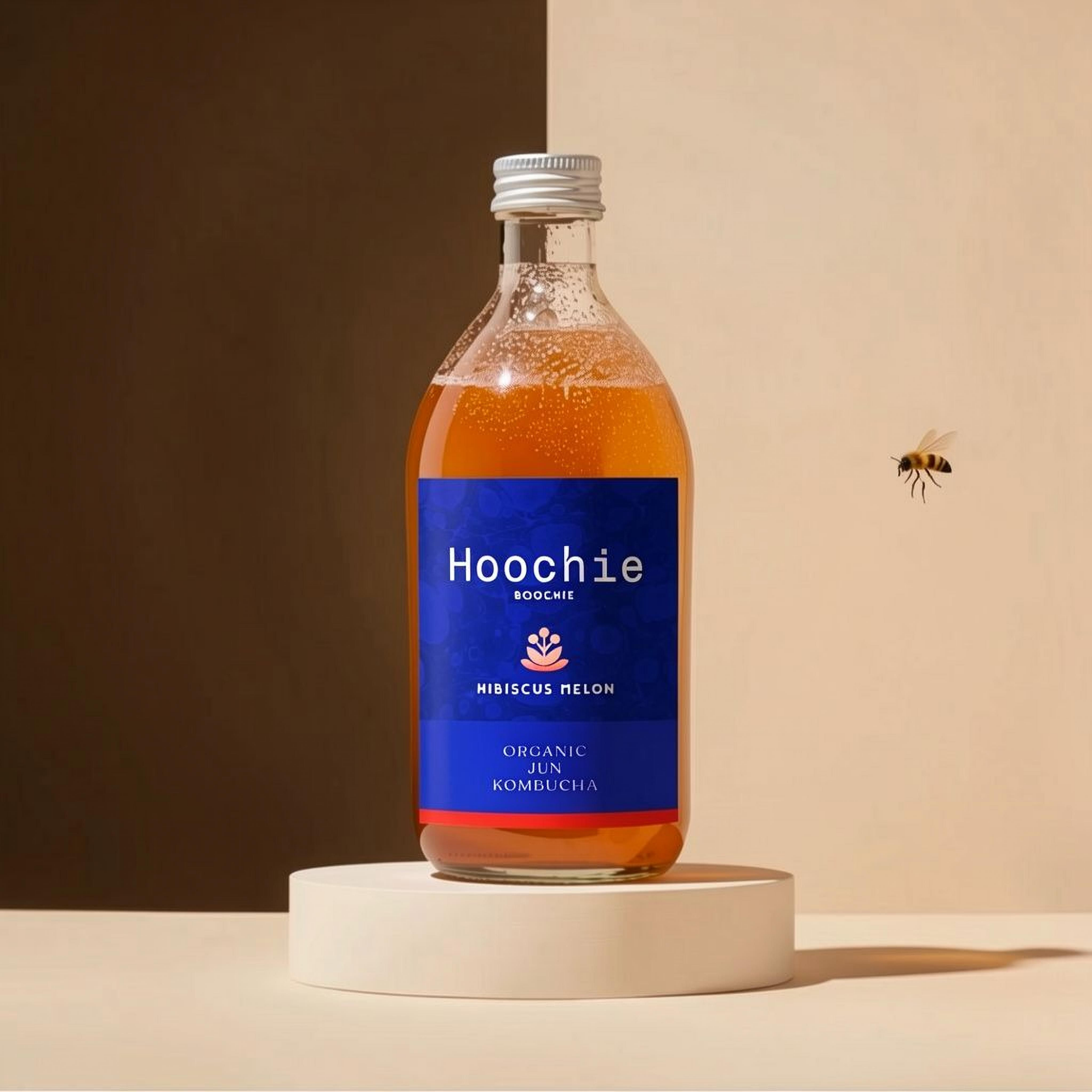
Exibit B
When everyone else is loud, quiet can read as confident. Or pure. Or authentic. Putting out a patterned or modular package system can turn a single flavor into a piece of a collection where the brand’s strongest expression lives on the retail shelf, exactly where it has to work the hardest.
None of these ideas costs more to print, or to plan. Just the tiny bit of audacity to make your drinks company about being more than a juicy fruit.