Brand Inspo: Barn Lime Bags
An accidental detour from architecture to artifact.
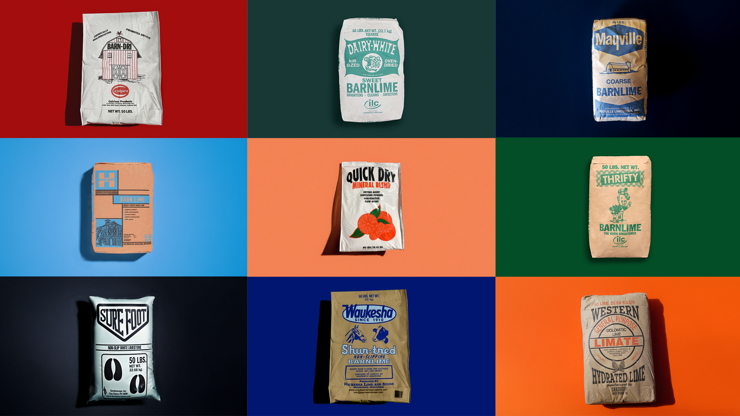
I’m not sure how this genre of artifact dropped into my lap. It surely had something to do with my recent relocation to Austin and subsequent investigation of local building styles.
I think when I Googled, “What is a barndominium?” I got at least one image result for barn lime for sale in its fun retro packaging that I can still go out and buy today. I’m also not totally sure where I’d turn to research origin stories on these bags and brands, but it feels like I fell down a wormhole, or uncovered an industry preserved in amber, basically untouched by time.
It looks like they’ve had the same package designs since the products were first introduced, circa early 1900s. A testament to the staying power of simplicity? Or possibly indicative of a fundamental consumer need that hasn’t changed much since it was discovered.
But still — super cool. And what a neat little diversion into design past.
Waukesha Shur-tred Non-slipping Barn Lime
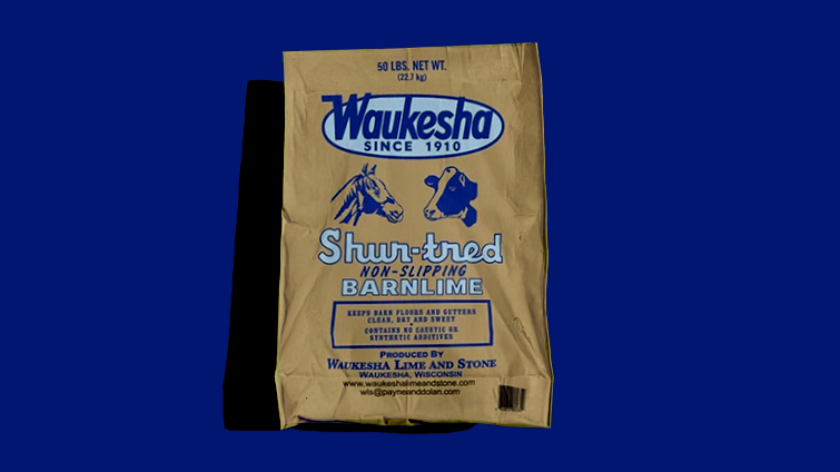
Since 1910, it says, and I believe it. It’s not my favorite of the collection, but the scripty lettering and the urgent italics underneath it are capturing my imagination.
Another cool thing to note about the industrial design vibe is how many different lettering styles are in use. I’m counting at least eight, not including the style for the logo. Each section or new line gets its own moment to shine. With that tempo on the change-up, it’s super important that the colors don’t vary too much (if at all) from style to style, else you’ve likely got a barn lime clown show on your hands.
Western Barn Lime
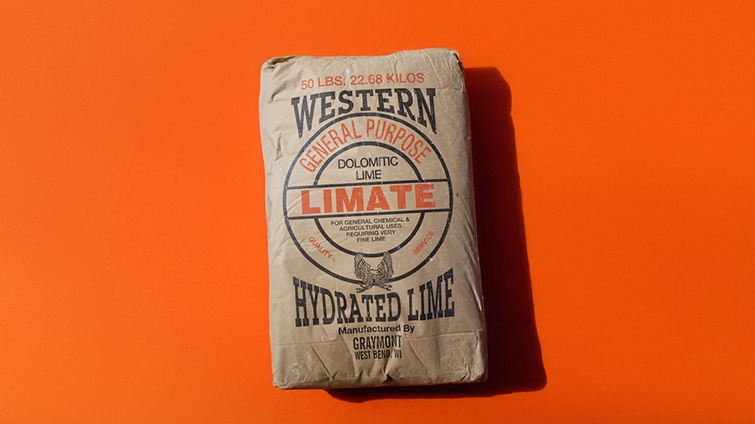
They’ve got two options for their lime, a general purpose and a “miracle” lime. Styles are a bit more conservative here, using a scant three to five typefaces for their packaging.
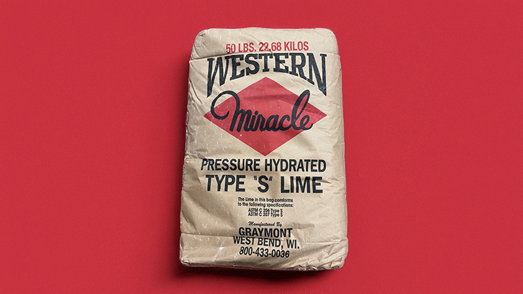
The ‘miracle’ product vibes with the “better living through science” era, balancing an emphatic script with geometric forms. Interesting that the cursive loop of the ‘l’ is filled in with color. Mistake? An artifact from when you had to cut and paste graphics together in colored layers and the containing bounds would have been too difficult to cut out? That, perhaps. I love finding little leftovers of design that hint at how far we’ve come in our reproduction techniques.
Sure Foot Barn Lime
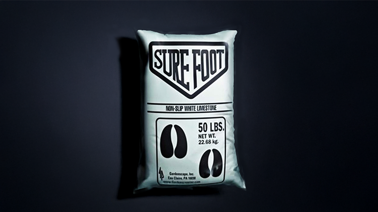
OK — there are definitely cow hooves on the package, so we know it’s for animals. And it’s got the rhombic logo container that directs our eye toward its all-important identification as non-slip white limestone.
I think it might be a bit late to admit: I’m not actually sure what barn lime is used for? Do they scatter it on the floor to keep things clean enough for animal hooves to walk on? Is the packaging so effective that we can intuit this information and get it right? The audience for this is so ingrained in its use that no explanation is warranted?
Regardless, the overall sensibility of this is interesting, but that handoff from U-to-R is quite quirky. I feel like this could be redrawn with minimal updates and feel very contemporary.
Quick Dry Mineral Blend
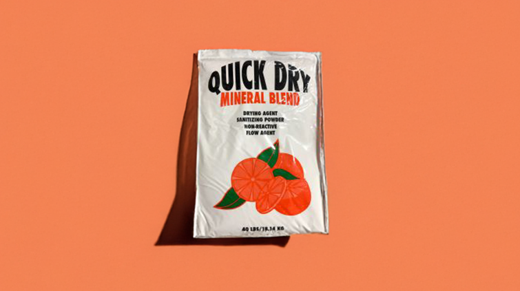
Look, right there on the bag, it tells us what it is used for. And yes, it mucks up messes. Amongst a sea of bovine clip art, this alone features vegetation. A fruit even. And I don’t know why.
Fresh citrusy smell? That seems unlikely for a barn product, because animals can be sensitive to scent. Do cows enjoy oranges? Again, this one feels like one of the newer introductions to the market, and isn’t quite as exciting a find. We still see the warped arch of text, and all we’ve got is Quick Dry as the brand name?
Mighty White Barn Lime
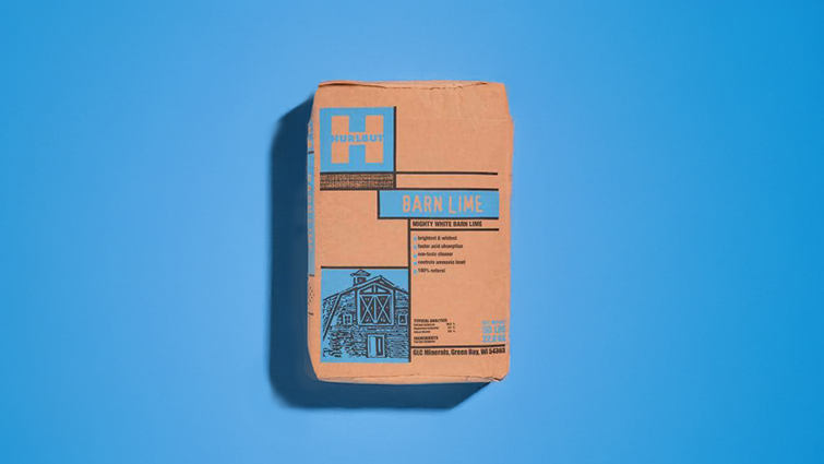
This feels so De Stijl to me, which is strange for a farm product. And I will confess I did write a senior thesis on Mondrian, once upon a time. So it jumps out immediately, strong right angles, boogie woogie boxes flooded with color.
But it’s barn lime from Green Bay, Wisconsin, not an art movement. They, too, have opted to tell us what it does on the bag, so perhaps their audience was a little newer to the barn lime scene, as I am. Hurlbut seems an unfortunate brand name in the time of the TikTok kids, and it looks like they might have rebranded to GLC Animal since then.
I’m also finding it interesting that so many of the brands are favoring the sky blue color, which I’m going to guess in this case is just 100% cyan.
Mayville Coarse Barn Lime
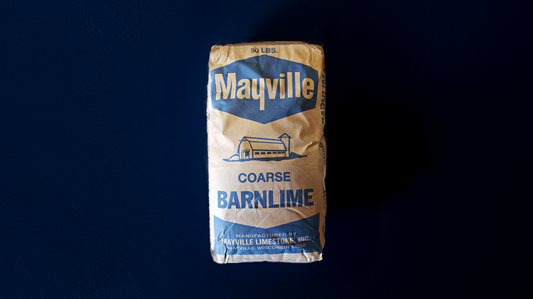
This was unintentional, but it seems we’re actually working our way toward my favorites. Mayville isn’t quite making the list, but I appreciate that we’re stepping back toward Pleasantville with the Elsie-the-Cow-blue, one-color printing and pastoral clip art. It turns out barn lime is crushed limestone.
Thrifty Barn Lime
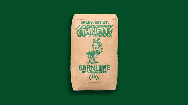
There’s a wee Scottish man in a kilt here, clearly outside in the grass. Holding a sparkling handful of barn lime?
I’m clearly loving that we’re using a clip art fellow with a goatee, but are Scottish people known for being especially thrifty? How did I miss this international stereotype?
We can also note repetition of the Scotsman theme in the tartan-backed brand label. At this point, however, given how little product differentiation exists on the packages, my assumption is that it’s basically a one-option product.
As in, you get whatever your local hardware/feed store stocks. Which basically means they’re speaking to captive audiences, and they can put just about whatever they want on the box, as long as the product works. So my one remaining, completely uneducated guess about this packaging design is it possibly says something about a strong Scottish sentiment in Iowa?
Barn-Dri Barn Lime
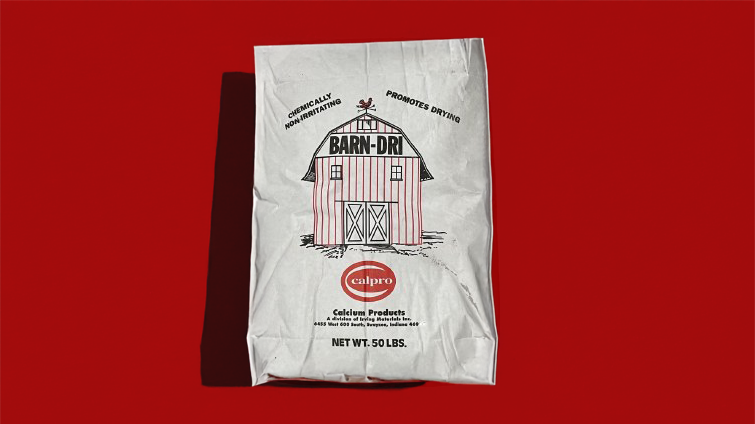
This is my second favorite, I think. And it’s probably because the line drawing for the barn and the choice of lettering make a very comfy stylistic pair.
It’s like the Sunday cartoon (the things that used to be printed in newspapers) where an old farmer remarks on the sublime beauty observable in their natural surroundings and a droopy-faced dog cracks wise about his ever-advancing years.
Like the stuff in the bag, the dog cleans up, in a chemically non-irritating way. I like the color switch-up from the blues these companies seem to favor. And the Calpro logo is quite admirable.
Dairy White Barn Lime
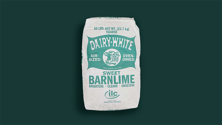
OK, this is it. This is the favorite. It’s apparently made by the same people who put out the Thrifty Barn Lime, which, I’m guessing, is why they share a similar aesthetic. As a design system, you could do worse.
But it’s basically the whole thing. It’s the weird chunky lettering that looks like it was cut out of cardboard by a rather precise toddler, the clip art cow, the pillowy logo container, and the fresh teal color that jumps off the clean white bag. It’s got it all.
It’s clearly a design from yesteryear (or an approximation — I could totally see someone deciding to take a package design all the way back, but this is the only design for this bag I can find). And it feels like it’s been printed exactly the same, every single time, for 100 years or more. And that amazes me.